Design Highlight: Global Exchange Reality Tours
I had the opportunity to be the web and graphic designer on an educational project with a team to build an e-commerce website from scratch. We decided to redesign the Reality Tours part of the Global Exchange website because we really liked the mission of the organization and thought they were deserving of an updated website that showcased their values.
Global Exchange is an international human rights organization based in San Francisco. One of their initiatives is called Reality Tours, a educational travel program that supports progressive values and people to people connections. I traveled to Jamaica and South Africa with them years ago, and learned a lot about myself and the people I met in those countries. The Jamaica trip focused on how free trade has negatively impacted the island’s economy, while the South Africa trip addressed race relations, HIV/AIDS and human rights in general in the post apartheid era.
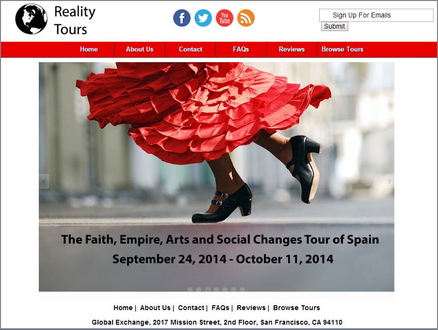
I was given the task of redesigning the website with a more up-to-date, polished look. The current website uses many dark colors with tribal motifs. In the redesigned prototype, I chose to use a minimalist theme with black text on white background and simple, clean code so there would be more emphasis on the images representing the many tours offered worldwide. The website uses responsive design. Due to the controversial nature of some of the tours and the goal of Reality Tours to give an alternative view of these countries, I made sure to pick images that reflected the different perspectives. I chose the brand identity “Where do you want to learn today” to help users think about what it would mean to travel on these tours.
The design for the logo was also clean and straightforward, as we wanted to emphasize the global reach of Reality Tours with simple black and white. Social media and email sign up share the top space with the logo to make it easier for users to share content online. The responsive navigation is the color red because we wanted users to be able to “travel” through the website with ease. Redesigning the website was a wonderful experience of bringing communication and social justice together.
Check out the website prototype here:
